We’ve all become familiar with beautiful, highly detailed, photorealistic architectural visualisations that showcase every aspect of a building or masterplan’s proposed design. These images are invaluable, allowing stakeholders to see the final product in intricate detail, from textures and materials to lighting and shadows. They’re highly persuasive, making them ideal for attracting investment and marketing to potential buyers or tenants.

BIG 120 Fleet Street
BIG 120 Fleet Street
However, while photoreal visuals are impressive, they may not always be the best choice at every stage of a project. One downside is that they can cause viewers to fixate on minor details, losing sight of the broader vision. This can be especially problematic during public consultations, where the design should remain open to creative input and alternative ideas, and photoreal images risk audiences forming fixed ideas about designs that aren't final.
We've recently worked with shedkm to develop a set of illustrative visuals that communicate their vision for Plot B within ACME’s Swansea Central masterplan, developed by Urban Splash & Swansea Council. We also developed a secondary shedkm development that utilises this sketch approach.
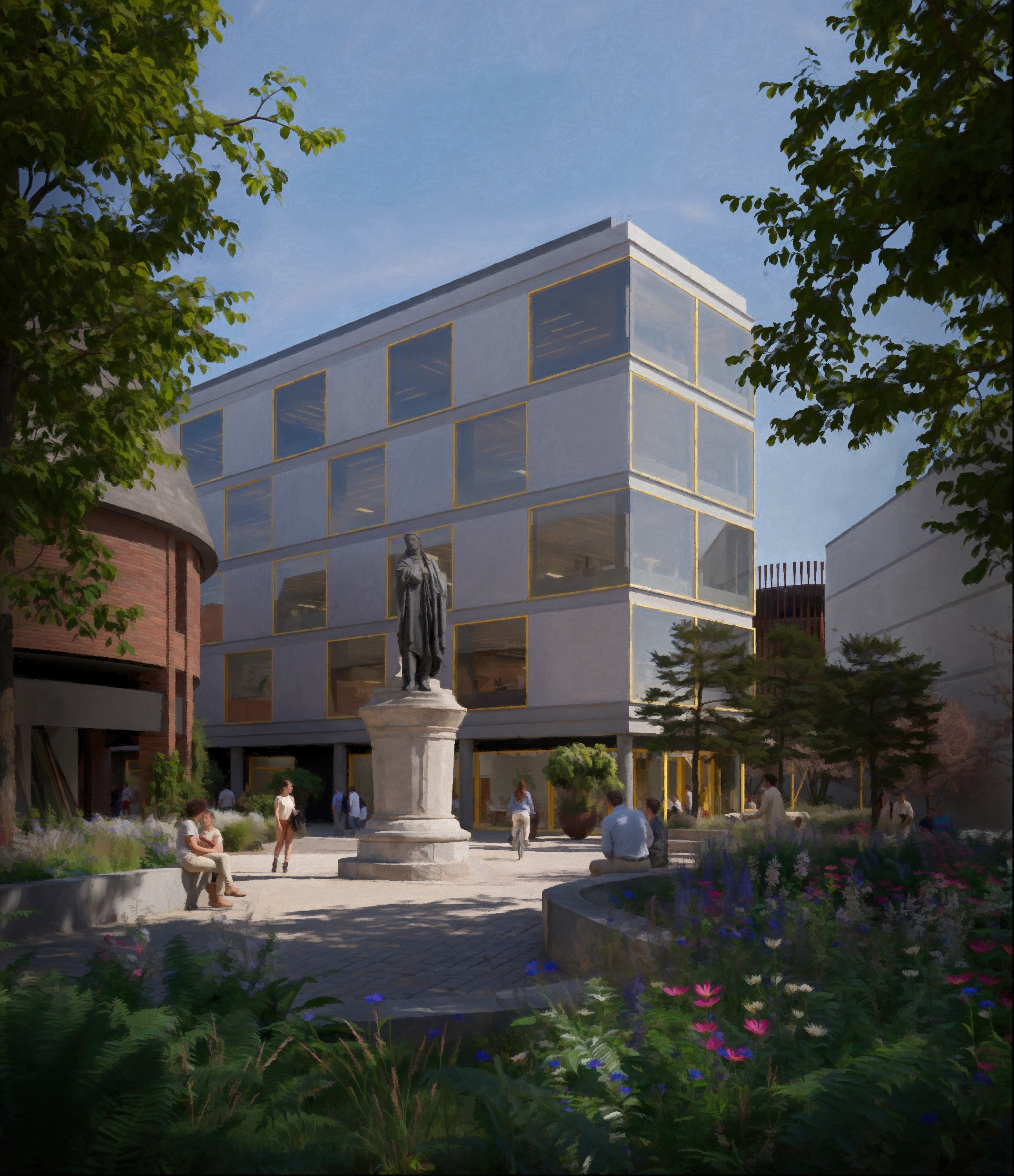
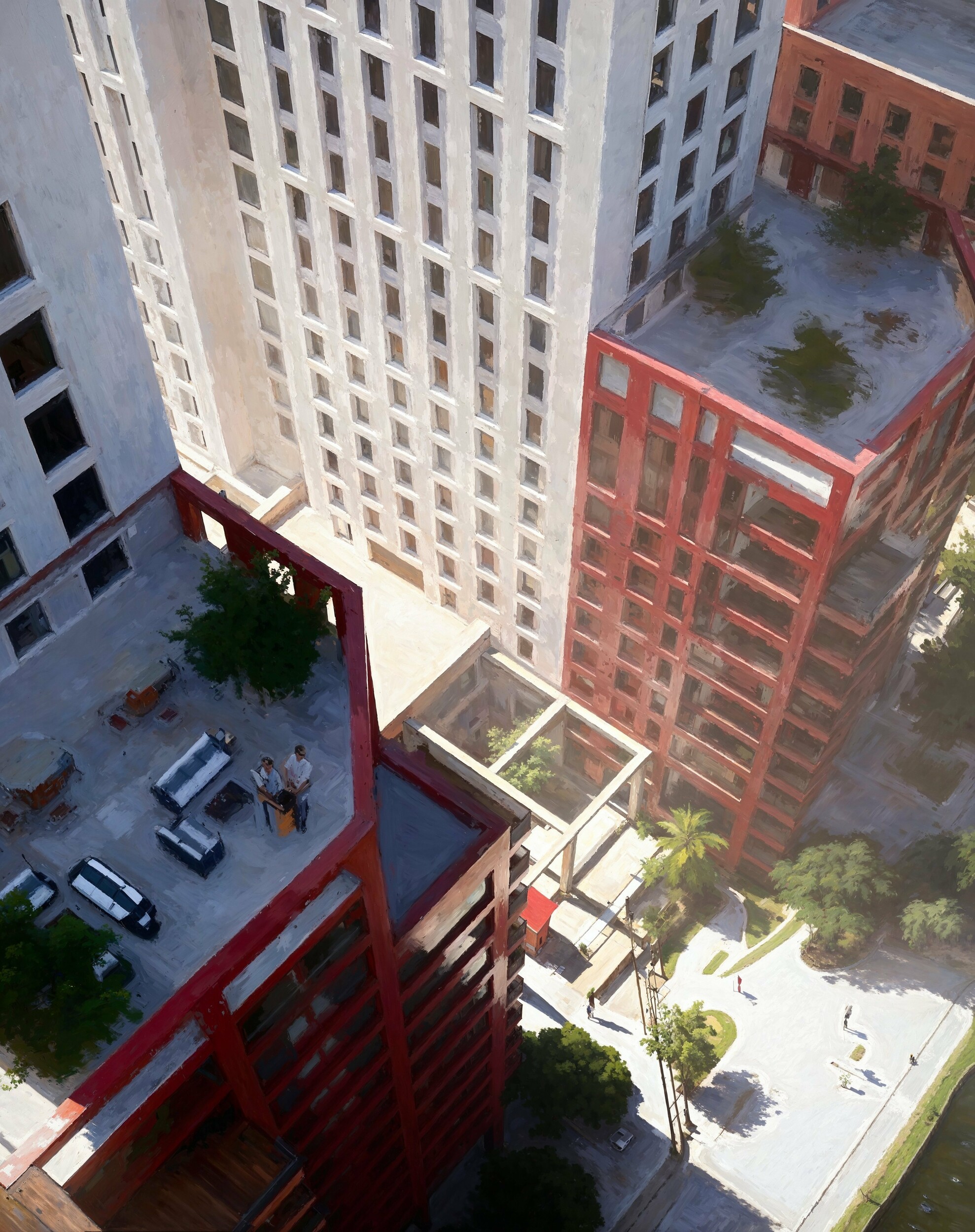
Part of a sketch scheme produced for shedkm
Instead of focusing on photorealism, we opted for a looser, sketchier style. This allowed audiences at the public consultation to appreciate the overall concept, focusing on spatial relationships and the design’s essence rather than being bogged down by unresolved details.
By leaving room for interpretation, these visuals encourage broader thinking, inviting viewers to engage with the design more interactively. They also evoke a human story, creating an emotional connection to the space. Plus, illustrative renderings are faster, cheaper, and easier to modify—perfect for the early stages of a project when ideas are still evolving and budgets are tight.
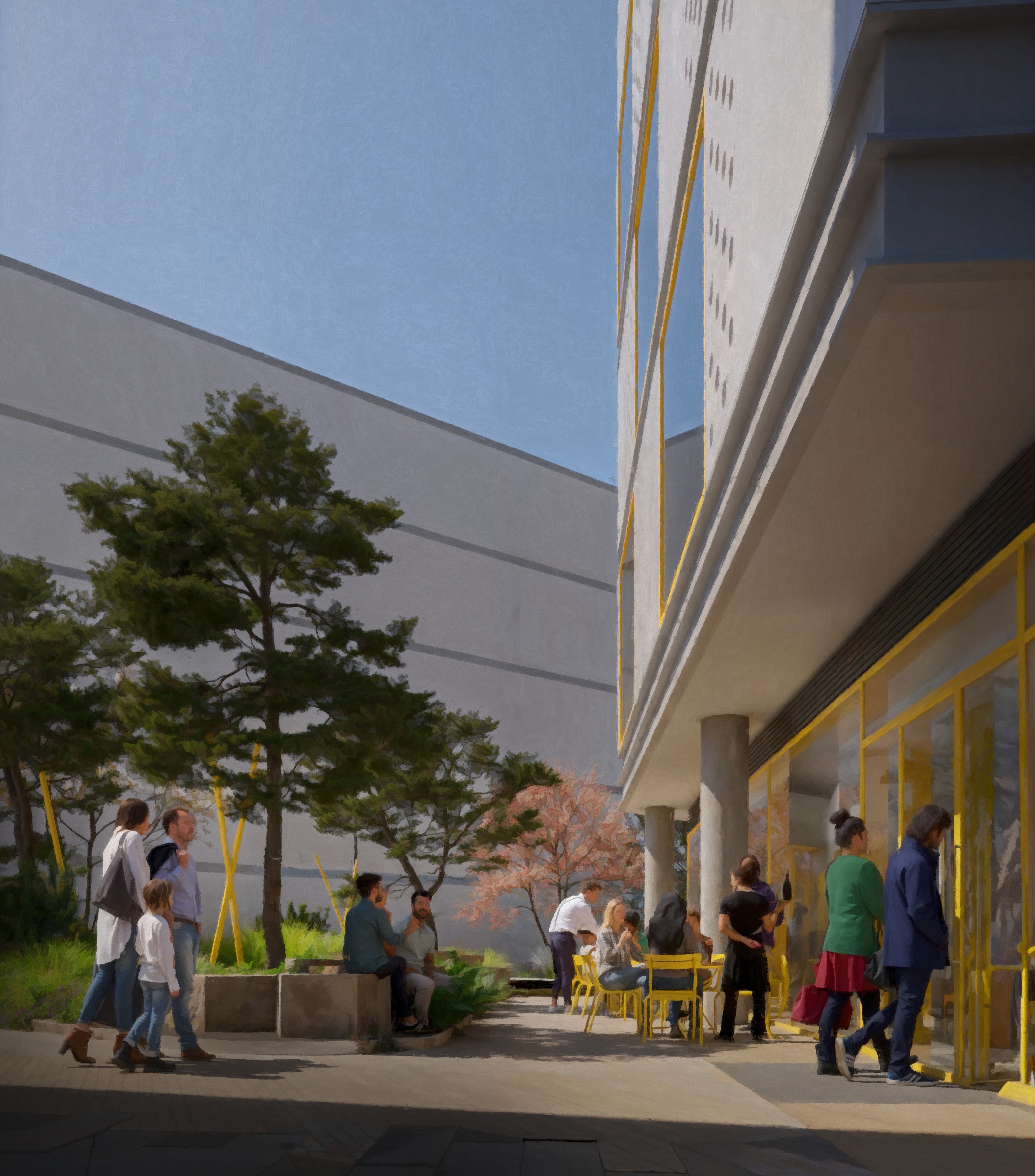
The illustrative, or concept art phase is the most exhilarating part of the project for us. It’s where we challenge the brief at speed, exploring different ways to tell our client's stories, whether through fresh compositions, dynamic moods, or eclectic narratives focused on people.
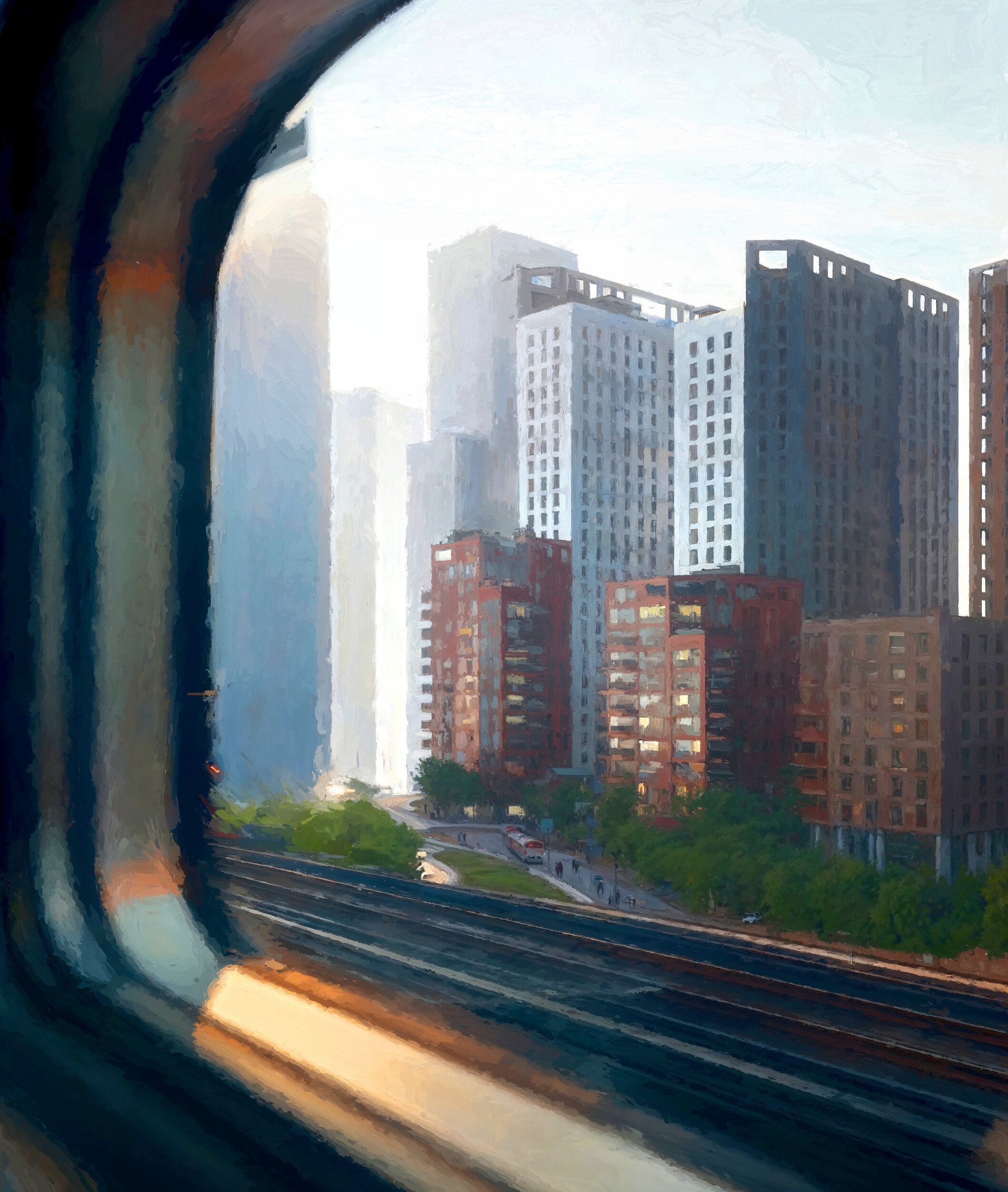
Inspired by the fashion photography approach, we present our clients with a contact sheet of diverse concepts, each offering a unique perspective on the story. This approach is often a pleasant surprise for our clients, revealing new ways to bring the narrative to life that might not have been considered in the traditional architectural visualisation process.
sketch scheme produced for shedkm
Part of a sketch scheme produced for shedkm
Our team finds this phase fascinating and it's has evolved into a product in its own right. In early design stages, where establishing a sense of place over design detail is crucial, the concept art phase allows us to focus on conveying that purpose. Alternatively, the contact sheet approach offers our clients a wider range of ideas to explore before developing the photorealistic CGI. We've found that this process sparks healthy design debates with our architect clients and helps developers build out their brand story, seeing how each image can impact a campaign from the early stages.
Our concept art phase is where the big idea truly comes to life.
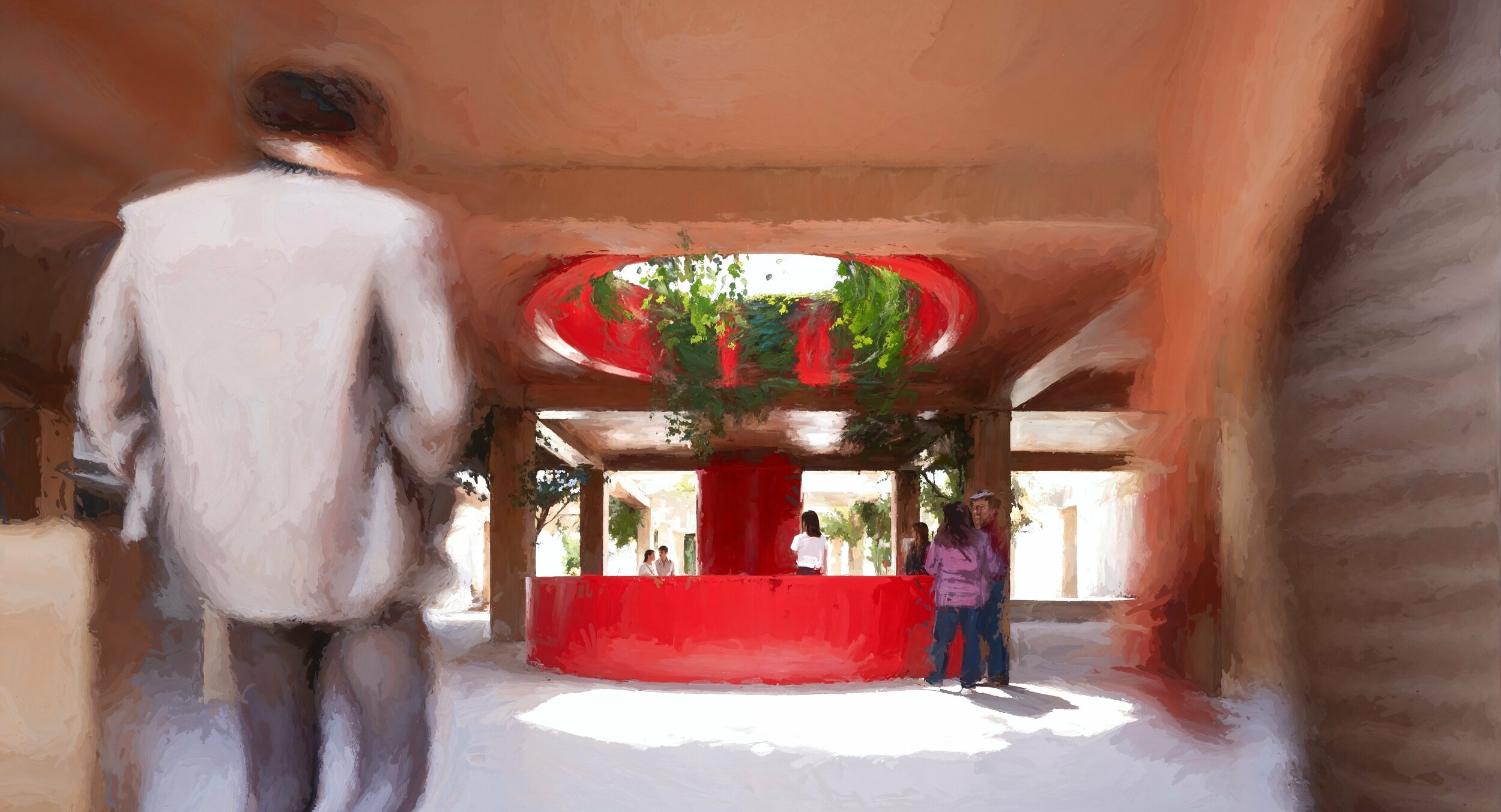
Part of a sketch scheme produced for shedkm
For early stages, the looser, more illustrative images are a key way for our clients to develop their brand story, stay open to creative input and save time and cost in the early stages of a project. As input is given and the design is solidified, clients can then move towards more detailed renderings to fine tune elements, present to clients, and finalise decisions. Finally, advance these from concept to a photorealistic CGI, to showcase the completed design with all the intended details and features.
In summary, while detailed visuals have their place, (we’re big fans of these), a looser, more illustrative approach helps foster creativity. By allowing creativity in these early stages, the design process can remain open and dynamic throughout, ensuring a result that simultaneously ignites imagination and exhibits the broader vision of a space.
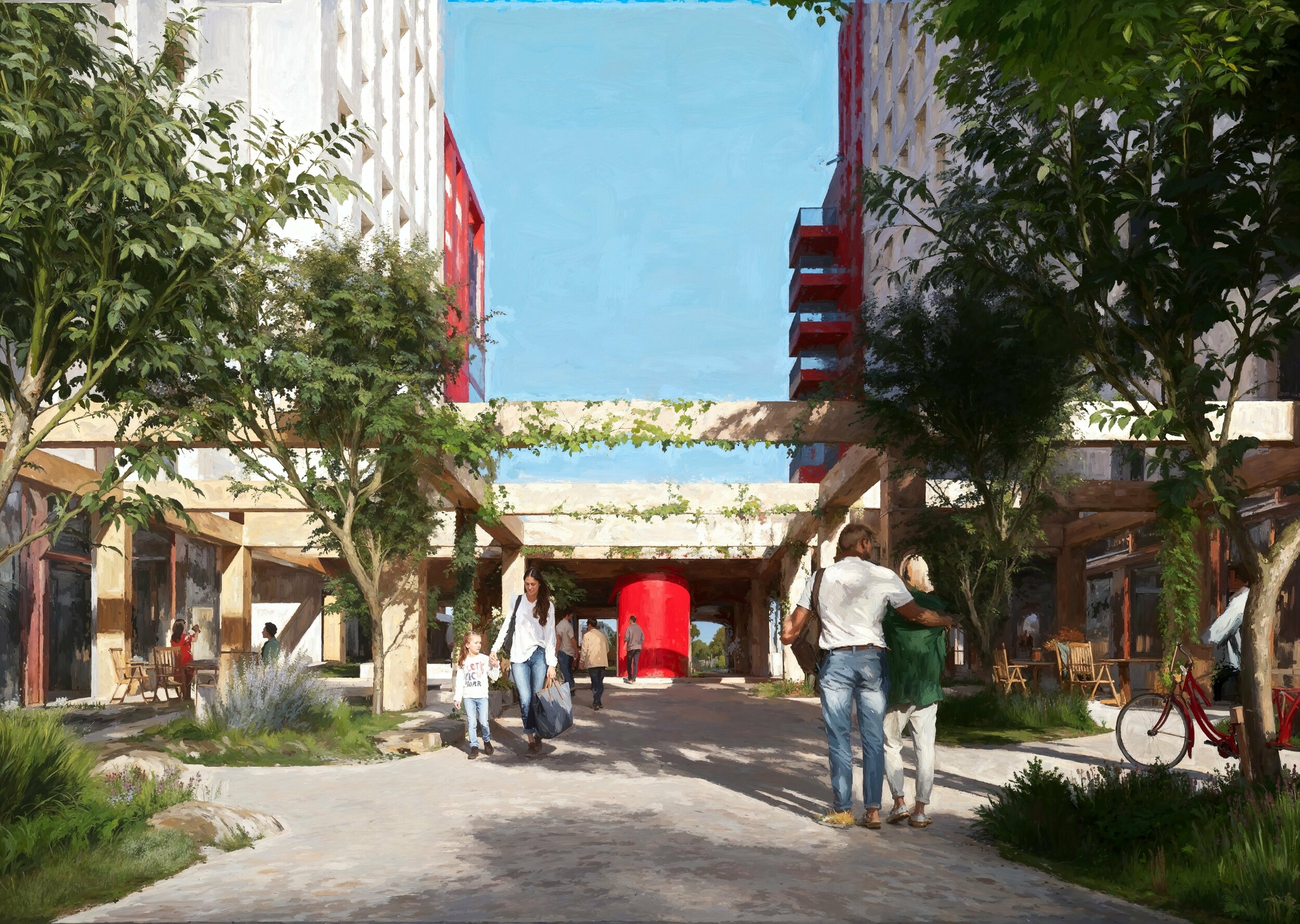
Part of a sketch scheme produced for shedkm
Interested in developing your own sketch images? Get in touch – email: [email protected]
